
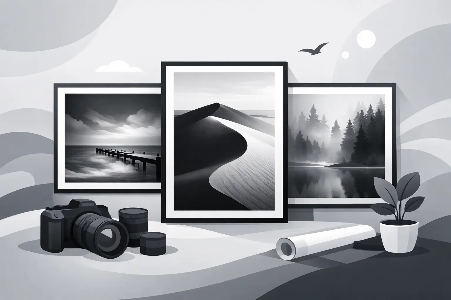
A well-made photograph changes as the light changes. In the morning, a silver-rich sky may feel quiet and restrained. By evening, the same print can reveal deeper contrast, more weight in the shadows, and a stronger sense of place. That is part of the enduring appeal of black and white fine art photography prints. They do not rely on color to attract attention. They hold it through tone, structure, texture, and the discipline of composition.
For collectors and design-minded buyers, that difference matters. A fine art photographic print is not simply an image placed on paper. It is the result of choices made at every stage – subject, film, exposure, development, printing, paper surface, contrast, and final presentation. When those choices are made with care, the print carries a presence that mass-produced wall decor rarely achieves.
What makes black and white fine art photography prints different
The phrase gets used loosely, and not every monochrome print offered for sale is truly fine art. The distinction begins with authorship and process. A fine art print is rooted in the photographer’s vision, not in a trend report or a generic decorating category. It is created as an artwork first, with the print itself treated as the finished object rather than a disposable output file.
In black-and-white photography, that standard is even more demanding. Without color, every visual decision becomes more exposed. Tonal separation has to be deliberate. Highlights need shape, not glare. Shadows need depth, not muddy collapse. Texture in stone, weathered wood, snow, water, steel, or cloud cover must be rendered with enough subtlety to feel alive on the wall.
This is why traditional silver gelatin darkroom printing still carries such respect among collectors and photographers. A fiber-base silver halide print has a physical depth and tonal character that comes from materials and handwork, not software presets. Inkjet printing can also produce excellent results when handled carefully and matched to the image, but the strongest prints in either medium are those made with restraint, technical control, and a clear understanding of how monochrome behaves in print.
Why monochrome still has such authority
Black and white is not nostalgia for its own sake. Its strength is that it simplifies without reducing. When color is removed, the eye pays closer attention to form, distance, weather, gesture, and the relationship between light and surface. That can make a mountain landscape feel more monumental, a railroad scene more historical, or a harbor image more atmospheric.
The effect is especially strong in subjects with inherent structure and mood. Western landscapes, old industrial forms, wildlife, maritime scenes, and historic architecture often gain clarity in monochrome because the photograph is no longer divided by competing hues. The image becomes more coherent. Strong lines carry more force. Tonal gradations become the language of the print.
That said, not every subject benefits equally from black and white. Some pictures depend on the emotional or descriptive role of color. Fine art monochrome works best when the subject already contains shape, contrast, texture, or atmosphere worth emphasizing. The most convincing black-and-white prints feel inevitable, not converted as an afterthought.
The role of craftsmanship in the final print
Collectors often ask why one print feels more substantial than another, even when both display the same scene. The answer is usually craftsmanship. Printing is interpretation. The negative or digital file is the score; the print is the performance.
In a darkroom print, decisions about exposure time, paper grade, dodging, burning, and chemical development shape the final tonal structure. A skilled printer can hold detail in bright snow while preserving density in dark timber. He can guide the eye through the frame by controlling local contrast. He can give sky and land different tonal weight without making the hand of the printer obvious.
The same principle applies to carefully made inkjet prints. Paper choice, ink set, black density, surface reflectivity, and tonal mapping all influence whether the image feels rich and grounded or flat and brittle. There is no universal best process. Some images are best served by silver gelatin on fiber paper. Others translate beautifully as inkjet prints on a paper selected for the right surface and tonal range. What matters is whether the process supports the photograph instead of overpowering it.
This is where one-at-a-time production becomes important. A handcrafted print is not treated like a warehouse item. It is made with attention to the individual image and to the scale at which it will be seen. That difference is visible.
Choosing black and white fine art photography prints for a space
A serious print should reward close viewing, but it also has to live well in a room. For homeowners, designers, and commercial buyers, selection is partly aesthetic and partly practical.
Scale comes first. A wide western landscape can hold a larger wall and create a sense of distance in a living room, lobby, or conference space. A more intimate image – weathered barn siding, a locomotive detail, a solitary animal in winter light – often works better in a hallway, study, or smaller seating area where viewers can approach it closely. Oversizing a subtle image can weaken it. Printing too small can deny a strong image the room it needs.
Subject matter also shapes the atmosphere. Mountain and plains imagery often lends calm and permanence. Railroads and historical subjects can introduce memory, movement, and regional character. Nautical scenes tend to bring rhythm and openness. Wildlife images can feel either contemplative or dramatic depending on framing and tonal treatment. The strongest choices usually reflect both the architecture of the space and the temperament of the people using it.
Framing and presentation deserve equal care. A refined black-and-white print generally benefits from simple, well-proportioned framing that does not compete with the image. Matting can provide breathing room and reinforce the print’s formal quality. Glazing choices matter as well, particularly in spaces with strong natural light. There is no single rule, but the presentation should respect the print as an art object, not reduce it to decoration.
What to look for before you buy
If you are comparing prints, look beyond the image on a screen. Ask how the photograph was made and how the print is produced. Is the work created by the artist whose name is on it? Is the print made to order with direct oversight? What materials are being used? Are the tonal values open and nuanced, or artificially harsh? Does the paper suit the image?
Editioning can matter, though not always in the same way. Some collectors prefer limited editions because scarcity is part of the value proposition. Others care more about consistency of authorship and print quality than about a strict edition size. Either approach can be valid if the artist is transparent.
It is also worth considering whether the print has lasting relevance beyond a current decorating style. The best black-and-white photographs are not tied to a color trend or a seasonal palette. They endure because they are built on structure, mood, and formal control. That makes them especially suitable for interiors where permanence and visual stability are part of the goal.
For buyers drawn to the American West, there is another layer of value in work that is rooted in firsthand observation rather than borrowed iconography. A photograph made with patience, field knowledge, and darkroom or printmaking discipline carries a different authority. That is one reason collectors continue to seek work from photographers whose practice is centered on monochrome craft, including specialists such as Colorado in Black & White.
Living with the print over time
The real test of art is not the first impression. It is whether the work continues to reveal itself after months or years on the wall. Strong black-and-white prints tend to do exactly that. They are steady companions. They do not exhaust themselves quickly.
A carefully printed photograph has room in it – room for atmosphere, for ambiguity, for memory, for the changing light of the day. It can anchor a space without dominating it. It can become more personal as you live with it.
That is the quiet strength of this medium. Black and white asks more from the maker, and often more from the viewer as well. In return, it offers something increasingly rare: an image with gravity, clarity, and the unmistakable feel of work made by hand.