
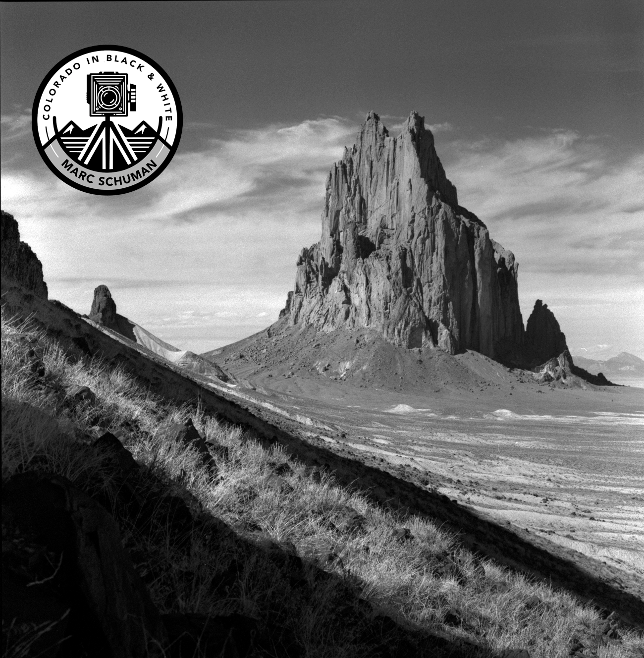
A red sunset can be persuasive for a few seconds. A strong black-and-white photograph can hold attention for years. That difference gets to the heart of why black and white photography is better for many subjects, especially when the goal is not mere description but lasting visual presence.
This is not a claim that color has no place. Color can be vivid, lyrical, and exact. But black and white asks more of the photographer and often gives more to the viewer in return. It strips away the easy appeal of color contrast and leaves the image to stand on structure, light, texture, timing, and tonal control. When those elements are right, the result feels less tied to a momentary effect and more grounded in form and meaning.
For collectors, designers, and serious photography buyers, that distinction matters. A monochrome print is often easier to live with over time because it does not depend on fashionable palettes or decorative intensity. It occupies a room differently. It creates atmosphere rather than demanding attention through saturation alone.
Why black and white photography is better for form
Black and white clarifies composition. Without color competing for notice, the eye reads line, shape, mass, and edge with greater precision. A mountain ridge against winter sky, the geometry of a railroad trestle, weathered boards on an old structure, or the curve of a wave all become more legible when color is removed.
This is one reason so many enduring photographs work so powerfully in monochrome. The image is built from visual relationships rather than color events. Light becomes the primary language. Dark and light areas carry the structure of the frame, and subtle gradations create depth in a way that often feels more deliberate than color photography at its most obvious.
For landscapes of Colorado and the American West, this matters a great deal. These places are often defined by dramatic weather, open space, rock strata, snow, dust, and distance. In black and white, those features resolve into tonal architecture. The image becomes less about scenic prettiness and more about land, weather, and presence.
Tone carries more emotional weight
A fine black-and-white print lives or dies by tone. Not just black and white as opposites, but the full scale between them. Deep shadow, luminous highlights, silvery midtones, and delicate transitions are where the emotional force resides.
Color often tells the viewer what to feel very quickly. Warm tones suggest warmth, blue tones suggest coolness, and bright hues create immediate stimulation. Black and white is less prescriptive. It allows mood to emerge through light and density. A fogbound harbor, an empty road, a stand of aspens, or a historic locomotive can feel solemn, restrained, or majestic because of tonal relationships rather than color cues.
That subtlety is one reason monochrome remains central to fine-art photography. It rewards sustained looking. The image opens gradually instead of spending its effect all at once.
Why black and white photography is better for timelessness
Color is often date-stamped by the era that produced it. Film stocks, printing methods, digital processing trends, and even prevailing tastes in saturation all leave visible fingerprints. Black and white is not immune to style, but it tends to age with greater dignity.
A well-made monochrome photograph does not rely on contemporary color grading or decorative trends. It can feel historical and immediate at the same time. That quality is especially valuable in subjects connected to heritage, landscape, industry, and memory. Railroads, historic buildings, wildlife studies, and nautical scenes often gain authority in black and white because the medium aligns with the gravity of the subject.
For art buyers, timelessness is not an abstract virtue. It affects how a print lives in a space over decades. Monochrome work generally integrates more easily with changing interiors, materials, and furnishings. It can anchor a room without tying that room to a passing palette or design moment.
Monochrome invites imagination
One of the paradoxes of black and white is that by showing less literal information, it often prompts more engagement. The viewer supplies something. Memory, atmosphere, and interpretation enter the frame.
A color photograph can describe the exact hue of a sky at sundown. A black-and-white photograph can suggest the feeling of standing there. That is not a mystical claim. It is simply the effect of reduction. When color is absent, the mind attends to gesture, expression, texture, and space with greater concentration.
This becomes especially potent in subjects where mood matters more than factual record. Storm light over open country, the worn metal of a steam engine, the patterned hide of wildlife, or the quiet dignity of a historic structure can all become more evocative when translated into tone.
The discipline behind better black and white photography
Part of the answer to why black and white photography is better lies in process. Monochrome is unforgiving in the best sense. It exposes weak composition, muddy values, and careless printing. There is nowhere to hide.
A serious black-and-white image is conceived differently from the start. The photographer must think in tonal relationships before the shutter is released. What will separate from the background? Where will the eye enter? Will shadow hold detail or fall into full black? Will the highlight remain luminous without becoming empty?
Then comes the print. This is where many images either deepen or flatten. A handcrafted black-and-white print, particularly one made with darkroom discipline or equally careful digital interpretation, is not a mechanical output. It is a final statement of the photograph. Paper surface, contrast control, tonal separation, and local emphasis all shape the experience of the finished work.
That is why collectors respond to prints that show real printmaking intelligence. The difference is visible. You see it in the richness of shadow, the presence of midtones, and the way highlights breathe instead of glaring. At Colorado in Black & White, that commitment to one-at-a-time craftsmanship is central because the print itself is the object, not a byproduct.
When color is better and when it is not
There are subjects for which color is essential. If hue is the subject, then color should remain. Autumn foliage at its peak, graphic modern interiors, or images in which precise color relationships carry the meaning may lose too much in monochrome.
But many photographs are improved, not diminished, by the removal of color. This is especially true when color distracts from the real subject. A bright jacket in a landscape, mixed artificial lighting in a historic interior, or competing surface colors in an industrial scene can all weaken the photograph. Black and white simplifies the frame and restores order.
So the stronger claim is not that black and white is always better. It is better when the subject depends on form, light, atmosphere, texture, or emotional depth more than on hue. In fine-art practice, that covers a great deal of territory.
Why collectors often prefer black and white prints
Collectors and design-minded buyers often gravitate to black and white because it offers both visual seriousness and practical flexibility. A monochrome print can command a wall without overwhelming the room. It can converse with stone, wood, metal, and fabric in a natural way. It tends to feel intentional rather than merely decorative.
There is also the matter of credibility. Black and white has a long association with photographic tradition, and for good reason. It foregrounds the photographer’s eye and the printer’s skill. In a market crowded with mass-produced imagery, a carefully made monochrome print signals authorship, restraint, and craft.
That does not make every black-and-white photograph superior. Poor monochrome work is still poor work. But when the image is well seen and well printed, it often possesses a depth that holds up in both private and public spaces.
The best reason black and white photography endures is simple. It reaches past surface appeal and goes straight to structure, mood, and memory. When a photograph can do that, it does not need color to prove its worth.